Bad Computer 2
Microwave oven controls
Here are the controls on an old microwave oven,

Turn one handle for power, turn another for time. Once the ‘time’ button is turned, microwave will start.
Here are the controls on a new microwave oven,

Easiest use: if microwave is set already, press the bottom button—which should clear the display. Press top button repeatedly for power. Press bottom button (which sets the ‘power’ and changes mode to ‘time’), Go up two buttons, then press on repeat. Time will rise in thirty second increments. If this is too slow, hold button down. If you miss the time, go down one button, then press repeatedly. This button can also be held down. When time is set, press bottom button again. Microwave will start.
The cost
The old microwave needed replacement so, none.
The end
Sequence figured from manual, then pasted to the wall. No other sequence or setting attempted. Microwave often left with residual power and time settings, because people set it wrong, then use a clock to avoid food burns.
Assessment
This was a replacement of new‐for‐old. The new microwave is, from it’s even cooking and power, if not premium, a good device. This layout of controls is shared by many modern microwave ovens. The old controls… I can’t be bothered to source parts data, but they must include some kind of clockwork or motor. This will make them much more expensive than a sequence of press buttons. The new microwave controls are unusable by those with learning difficulties. Which may be regarded as a good thing, but only in some circumstances, as they are unusable also by the elderly. The multiple modes of the microwave setup routines—defrost, auto‐time, weight‐dependant cooking etc. are unused, because even people who may use them can not remember the sequences. A more intuitive layout of button would be power up/down, time up/down, and set/reset/start buttons.
Coop Bank locked account

Locked because I wanted to retrieve some financial information, so tried browser‐access on my phone. Three attempts later, my account locked. Also, I can’t use Chip and PIN, though I think simple swipe to limit worked.
Anyway, I don’t mind a bank flagging suspicious activity. But ring procedure accessibility is poor, offering maybe ten seconds to enter an account number and sort code? First time I ring, I’m cheerily told that the entire Coop Bank computer system is down. I try next morning. I’m told the wait time is fourty minutes. I try later in the day, wait twenty minutes for a service representative who sends me a ‘one time password’. But the representative didn’t it seems lift the lock on the account. The ‘one time password’ didn’t work in Google/Chrome/on a laptop/on a mobile phone/or if typed in rather than copied.
Phone‐call hold is two pieces of tinkly new‐age music interspaced every minute with a message “Your call is important to us. Please hold while we try to connect you to a customer service representative’. The Coop bank website publishes no help information on locked accounts.
I wasn’t going to feedback about this performance, because the reasons clearly lie beyond a fix and it’s far from the worst performance imaginable. However, the bank sent me a form encouraging me to attack the performance of the service advisors, so I sent back a link to this page.
The cost
31 hours overall to fix. I was ill that weekend, so was unable to buy food or medicine in this time.
The end
Reset by the second ‘one time password’, typed rather than copied.
Assessment
Security locks, no problem. Support by chargeable number, with poor accessibility procedure, poor response time, no‐information messages and no online help. Not much good in this (aside from the second customer service representative, who deduced possible issues and offered alternative routes to a reset).
Mobile phone file handling

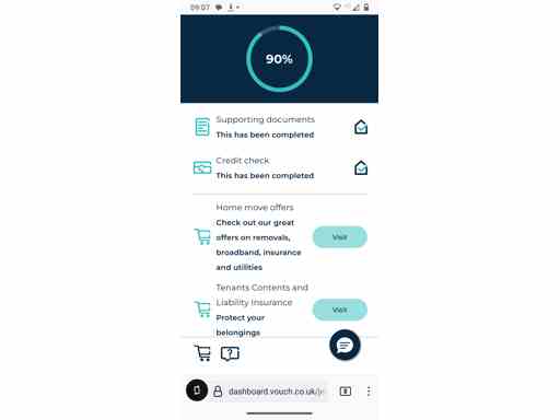
I was originally going to write about a phone app called Vouch. But the source problem is not the Vouch app, it’s the state of file movement to and from mobile phones. My need? An app connected to the Vouch app, Tink, did not list my bank as a bank that uses Open Bank API. So I needed to upload ‘supporting documentation’, in this case payslips.
Now, anyone who works an office using a mobile phone will know what’s coming. My payslips are paperless, held in an office system. So I needed to download them, then email to a personal email account. The phone can then see the payslips, which can be downloaded then uploaded to the Vouch app (there is another option— go to the bank for paper copies of my account, then take photos). Those processes are ugly but make sense.
My first choice option went haywire soon as the email reached my phone. I was offered only two options for download—to my Google Drive, or to open in my PDF app Foxit. A Google cloud drive is a chaotically‐organised, unnecessary and potentially insecure dump, so not for me. Foxit has very limited downloading, offering only it’s own folder or a nameless ‘download’ path—who knows where that is? I tried ripping out the Foxit app and the downloads went to another ‘helpful’ path, now set by the Android system, with no notation. Worse, the Vouch app, in Firefox or Chrome, refused to open any kind of upload browser.
So? I sent myself the Vouch link then tried opening on my laptop. It worked and, behold! verified. Now downloading the payslips from email was trivial, to a ‘Downloads’ folder. Uploading to Vouch was easy too—on the laptop browsers, the Vouch website suddenly displayed a sophisticated file uploader with appendable entries and a submit button—with standard browsers to reach those downloaded files.
The cost
A morning. In full, a night also as I needed to return to my room to reach the laptop.
The end
I uploaded the files to the Vouch app.
Assessment
I’m not a regular user of conventional computer and mobile phone systems. I recall recently being disappointed I couldn’t hardwire (USB) or use Bluetooth to transfer a few phone photographs to a computer. As for downloading files on Android (and far as I know iOS/Apple phones), it’s bewildering that it’s impossible to dump in a custom folder. Yet customization of app browsing, and the systems themselves, make this sometimes impossible. Apps often opt to ‘helpfully’ open files in secondary apps with no stock ‘save’ options. It’s no wonder people use email and multi‐stage processes to move a few files. Or that people hate PDFs, because who knows which app a PDF will open in? And don’t tell me networked files (‘the cloud’) is the answer, because they are often unavailable or limited in access. Stock desktop file browsers may be clumsy, but ‘helpful’ replacements drive millions to madness.
Streaming Channel Subscription Interfaces

Let’s talk about what is happening here. It’s a recent phenomenon, maybe round the time of COVID. The more general streaming channels try to gather the many subscription services under their online interfaces.
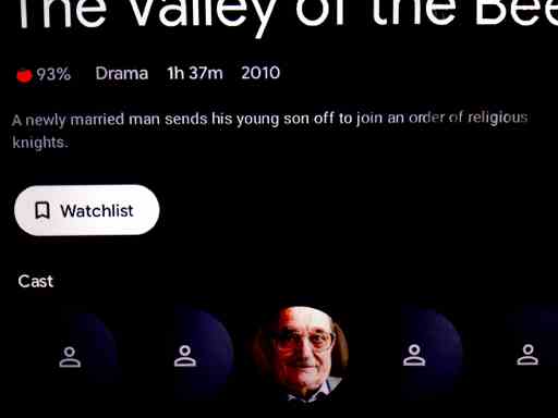
Exhibit; the provided screenshot, a list‐item from Google Play. What does ‘Watchlist’ mean? It’s a near‐prototype example of help as self‐promotion—it means ‘This item is not available through apps on your TV, or perhaps because we don’t have access to that subscription service, but click this and we’ll tell you when it becomes available’… suggesting what? If copyright expires in the next seventy years? We the people searching buy a new TV? The channel manages to conquer the world of available film stock through skip‐diving, natural disaster, or aggressive buyouts?
It’s tricky to search for information, but sources reviewed the then‐new YouTube implementation then concluded it was convenient for consumers (in access?) but offered no other advantage of cost or availability. I go further—the interfaces of the YouTube and Google Play implementations are misleading. As for that ‘Watchlist’ button, I call ‘bad computer’.
The cost
A friend upset she can’t watch videos anymore, distressed because she feels she has done something ‘wrong’ (she hasn’t), and a morning passed understandings the cause. Perhaps an evening fixing a logon broken as result.
The end
You can see information on items but don’t know why, even with payment, they can not be played. On YouTube, via payment methods, a user can loop links—a known fail of internet design. On Google Play that ‘Watchlist’ button is customer service ugly.
Assessment
Can I be bothered? Ok, I’ll try. Not that anyone would listen.
In part, this gathering of channels is an answer to a customer service issue. As bodies of work are gathered—archives of TV, film, and modern generation of film—then enabled for online access, the number of apps needed to play the different services has become many. It’s confusing. So natural for the more central providers to gather possible product through their interface. Yes, this maximises their revenue, but the single point of access also makes life easier for the consumer. Google Play and YouTube have for sure have both announced and rolled implementations, I’ve not looked at Amazon Prime, but I expect so.
I’m not complaining about this gathering. It’s a consumer need and approved behaviour for a corporation. But I don’t like the implementations. Whatever you think of YouTube, it had one joy—you see a list of items (from the second‐most used search engine in the world), then click on one. But now, click on an item of film and half the time it’s not available. YouTube signals with a big button that the item is available to ‘subscribe’, but not from who, what ‘subscription’ implies, how access will work, the payment involved… and the payment options loop. I could analyse for pages about what this means for users, and why, but won’t. Why talk about the technical detail? End result; YouTube ‘doesn’t work’.
YouTube is not the only implementation. Google Play, and I have read Amazon Prime, have also integrated subscription streams. The more abstract interface of Google Play may provide a better user story. But only if Google provide the relevant information. They do not. They provide a ‘Watchlist’ button, and it stinks.