Bad Computer
A list of experiences when modern computing has degraded quality of life. I don’t know why I havn’t done this before—it starts now.
I’m not out to ‘name and shame’. If anyone takes this like that then I’ll anonymise the entries (and I don’t need a public order to act on that). Often, the causes are tangled, and the company can’t do anything. But detail is of evident use here. In all cases I feel I have made efforts at resolution, or the subject is plain enough, to justify publication. I do want to prove that computing is only as good as the people who make it. And that it can be inadequate, publicly.
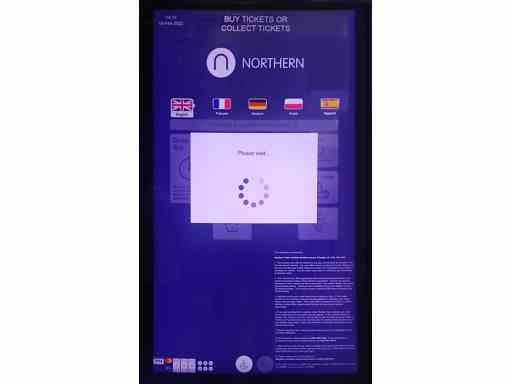
Northern Trains, ticket kiosks
Since I’ve lost correspondence, I’m guessing at dates. This case may date back further.
Periodically, I make journeys across territory covered by Northern Trains. At most/all stations, Northern provide kiosks for ticket purchase.
My concern is with the kiosks at the larger stations. My complaints are mostly rooted in the touch screens on the kiosks. The screens are insensitive, sometimes they can be pressed with no result. The screens are also surprisingly inaccurate, sometimes performing unintended actions. This inaccuracy is muddled, for the general user, with the underlying computer system, which can slow down when busy. This of course causes repeated keypresses by users—leading to unintended results. There are some other user interface complaints also—but I’m not detailing those.
How severe is this issue? Is it a personal gripe? Well, at one station I have always encountered a queue for the kiosks—which would ideally reduce queues. At another station, I once reached the front of the queue because the two people in front of me abandoned attempts to buy tickets from the kiosk. Yet another time I saw a man hit a kiosk in frustration. I’ve twice missed trains because the kiosks were slow. That’s common enough for me.
I’ve twice supplied feedback to Northern Trains. The first time, I was offered one of those online forms that could only have been pinned together by someone doing a job with no concern for the customer. The online form did not differentiate between a request for a refund, and a wish to give comments, so I was dragged through a process asking me to supply times, dates and location of travel, then asked me to surrender large doses of personal information. I can’t remember the result of that. The second time, the process was more pleasant—had Northern Trains responded to feedback?—and I used a card. I received a reply that was generic—from the reply you could not tell what I had commented on. After I emailed a reply, I received nothing. However, since that time, I’ve received emails from Northern to ask me ‘How did we do?’, and if I would like to join their customer panel.
The cost
Measurably, two missed trains.
The end
These journeys are a natural for trains. Trains are fast, smooth, and the end points are convenient. But, almost always, I use buses or coaches. Compared to the booking systems, other differences are, for me, negligible.
Assessment
Please note, I do not expect Northern to change the kiosks. Northern will be tied to contracts, so changes would be time‐consuming and perhaps expensive. And who knows where responsibility rests? Also, the kiosks may have been changed—I’ve not checked recently.
In my small experience, Northern Trains staff excelled at customer service—sometimes under pressure caused by the kiosks. The kiosks have a poor touch screen and user interface issues.
PayPal, two‐stage authentication
I have a PayPal account for use on EBay. I had not checked the account for a long time. In that time PayPal upgraded to two‐stage authentication. Also in that time, my old phone and SIM card had been destroyed. My password was ok, but no logon. How to proceed?
Password reset also needed a phone number, so can’t be done
Contrary to advice, no alternative authentication method was offered
Emails from PayPal advised me to logon—not possible
Paypal help required PayPal logon, so no way to ask for help
Online advice from semi‐official PayPal sources said that the warnings were clear and issued for months. A thought for whoever posted that advice—what if I had been in intensive care? There was a stream of other semi‐official advice, including contacting via Twitter and, of course—a clear signal of customer service workers who do not have an answer—a suggestion to clear browser cache.
Was there a way out of this? I thought of one—I created a new PayPal account specifically to reach PayPal Help. I then successfully contacted the online ‘chat’. I was advised to call a charged phoneline…
It has not been possible to connect your call. Please try again later.
When I got through, a customer service representative agreed to remove the phone number from the account. But then the representative realised they were unable to grant access without further authentication. Which needed a different phoneline.
After a few days I was able to contact the new line. The trick was to ring at an inappropriate time and ignore warnings. After some talk—about why I had two accounts, and why one was locked with no phone number whatsoever—and a supply of security details, the original account was unlocked.
The cost
Time on the charged phone lines, 20+ mins. Time to conclude this issue, three weeks.
The end
PayPal resumed. Security compromised by two accounts.
Assessment
PayPal were, on this issue, enabling modern security. Without a mobile phone, a fix would be impossible. PayPal were overwhelmingly difficult to contact. The help procedure was assembled by people whose concern is not customers. Once contacted, PayPal customer help is above average.
(British) Ordnance Survey website
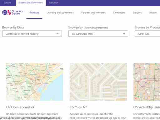
I’ve miscategorised, you think? The Ordnance Survey—it’s a government website? If you visit the site, you see a beautiful layout, clearly top‐notch government work. So you think, “He’s got this wrong”. No he hasn’t. Let’s try use the site. The British government has policy for releasing some kinds of data open and free—for some time, this data release has included maps. So let’s see what maps are available for free? There is a way,
Products > Licence Agreement > OS OpenData (free)
You get a list of products. What you might miss is that there’s a second filter box,
Browse by Product type > Open data
Miss that and you’ll receive a list that includes variations with paid, commercial product options. Still, this is not the only issue (if it was, the site would not rate being listed here). The list has items composed from beautiful images of maps, with notes underneath. Again, good, except the images are presented with art, which means they have none of the hoped‐for information an image could provide at this point—what scale of map am I looking at, what kind of formats, what levels of information will I receive with the product? Aside, the list may be multiple pages long, but you will not know unless you scroll to the bottom. Let’s click on a link. The only evident links are called ‘contextual or derived mapping’. This leads to another list, with no differentiation, except it’s larger. Which has lost the ‘free’ filter, so you now don’t know what you are looking at. Let’s ditch this and go back to the original list, where you may, by scattershot clicking, discover that the images themselves are links that lead to details of the product item. Progress! Yes and no. The information is generic, so, again, you are offered paid products—‘Need a more detailed map?’ The ‘How to get this product’ tab leads to a section with a bulleted title (which bullet looks like a radio selector, for nothing in particular) which says,
Our open data products are covered by the Open Government Licence …
That’s not how to get it is it? At this stage, this site heads fast towards being listed in Bad Computer. Maybe you noticed a button at the top ‘Free Download’ Maybe that leads to a download page. But on several pages it will lead to contorted discussion of licencing, or how data is available through ‘over 400 partner organisations’. You’ll be encouraged to register—for what, and to what end? At which stage, this site rates a listing—for a handful of poor usability choices, lack of structured information delivery and, most of all, failing to deliver coherent paths through data readily available.
The cost
Well, will you find what you want, or not? I bet you won’t, and it will take an hour, and maybe useless downloads, to determine what could be told in less than a minute. At the end of this, you will never know if you found an appropriate item.
The end
I found some information. And not other information.
Assessment
The idea is to make map data free to encourage research and innovation. Not only does the main site fail to deliver this, it obscures the process. Is this conflicted policy in construction? Is this a by‐product of a website with multiple demands placed on usage? Is this deliberate (for example to favour business partners)? One thing I know, there’s no point making a query to the organisation—no more effect than throwing a thimble at a battleship.
Better UK, the app
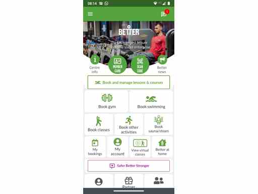
I contacted my local swimming baths. To book time in the pools, the counter staff recommended the Better UK app. As you see from the picture, on a mobile phone the app has clear presentation. I can also tell you the app has solid behaviour. However, that’s all the good I can tell you.
My first request is for the opening times for the pool. The overall opening time of the centre is readily accessible through “Centre information”. But,
Opening hours for the pool, or other activities, are not available
A timetable is available, but to find opening times means cross‐checking pool availability across days
Of all things, the timetable includes a ‘key’ for session styles such as ‘Over 60’, ‘Teaching’, ‘Women‐only’ etc. I recall HTML Spec advises against this (legends should be unnecessary, and information is too fine‐grained)
I must read the general information tab ‘Facilities’ to discover that a swimming session lasts one hour
At least there is a tab ‘Activity Prices’. But what is a ‘member’? Member of what? There is a tab ‘membership’ which offers a list of membership styles—local, national, concessionary etc. But with no overview. The help pages explain, answering questions like the difference between an ‘For All’ and a ‘Fitness’ swim session (the fitness session has lanes). But why do I need to go there—that’s not when I needed the information?
Though I had no intention of booking at that time, I went to ‘bookings’. This is the behaviour of someone accustomed to the web. I was offered the type of session—‘For all’, ‘For 60+’ etc. ‘For all’ gave me no information for the current day, not even if I ticked ‘Display fully booked sessions’. So,
Not possible to see an overview of available sessions for the day
Back button required to change the session style—the offered box has no options
Would be intuitive if the session style (‘activity’) box accepted no input, so displayed all kinds of session style, which makes an overview. Doesn’t work
A ‘Swim for fitness’ session request offered a slightly more helpful timetable display. Any positives? The app,
recalled my chosen activity centre.
has clear links to step backwards and forwards by day
But that is no compensation.
Finally, it would be useful to have general information on who is in the pool and when. I don’t want to arrive to find twenty children there, and I’m sure they don’t want to see me. But, despite the fact the database will hold that information, it is not shown. There may be a Data Protection issue round this idea, but I can’t see anything wrong with publishing user statistics such as ‘The pool is quiet at 7am’.
That’s about the app. I can add two extra discouraging items to this experience. First is personal. I’d say there were specific gestures in my talk with staff that suggested, “We don’t want people like you using the pool”. Prejudice is part of my everyday life, and I’d say, subtly, it was here. Second, I usually make an effort to resolve these situations. But a month or so later, I was walking through town and saw this advert on a bus stop,
A HEALTHIER COMMUNITY STARTS HERE Whether you’re taking the first steps on your fitness journey, or looking to keep in shape, you’ll find everything you need at … Pop in now, or join at better.org.uk/…
Followed by a QR code. I call bad‐computer.
The cost
One and a half hours to gather any information on what is available and when. I bought swimming trunks. They’ll go to a charity shop.
The end
A pity if a disorganised app and discouraging staff lead to closure of a swimming pool. But I abandoned the idea of swimming as potential exercise.
Assessment
Bear in mind the app enables access for many purposes, and is used as the front for many mid‐size services. I am only talking about one branch of use, to book a swimming session.
Good information, poor organisation. No overview filtered by activity. Unhelpful information filters by date. Unintuitive information sorts by time as opposed to activity. Unclear split between information and booking. Can not display the most useful information of all—is it busy? Also, I didn’t try, but online reports say the payment system is difficult. As the web guys call it, my ‘user story’ would be,
Give an overview of opening times and prices
Explain what the sessions are, let me select
Give prices
Give me information on sessions by day
Give me statistics about how busy the pool will be
Give me a link to to book a session
Either disordered or not available.
In summary, for customers without computing skills, the app will discourage use. Even after a successful first visit, customers will experience difficulties.